For years, home design was dominated by a single, cool rulebook: bright white walls, flat gray cabinets, and polished chrome accents. While that clean-lined aesthetic served its purpose, home design has taken a decisive turn toward comfort, character, and depth. Today, we are seeing a massive shift toward richer, more organic palettes that make a house feel truly lived-in from the moment the paint dries.
Whether you are planning a full-scale kitchen remodel or updating your main living areas, choosing the right color palette is one of the most impactful decisions you will make. Here is a look at the colors, finishes, and material pairings that are defining modern residential design right now.
The Great Shift: From Cool Gray to Warm Neutrals
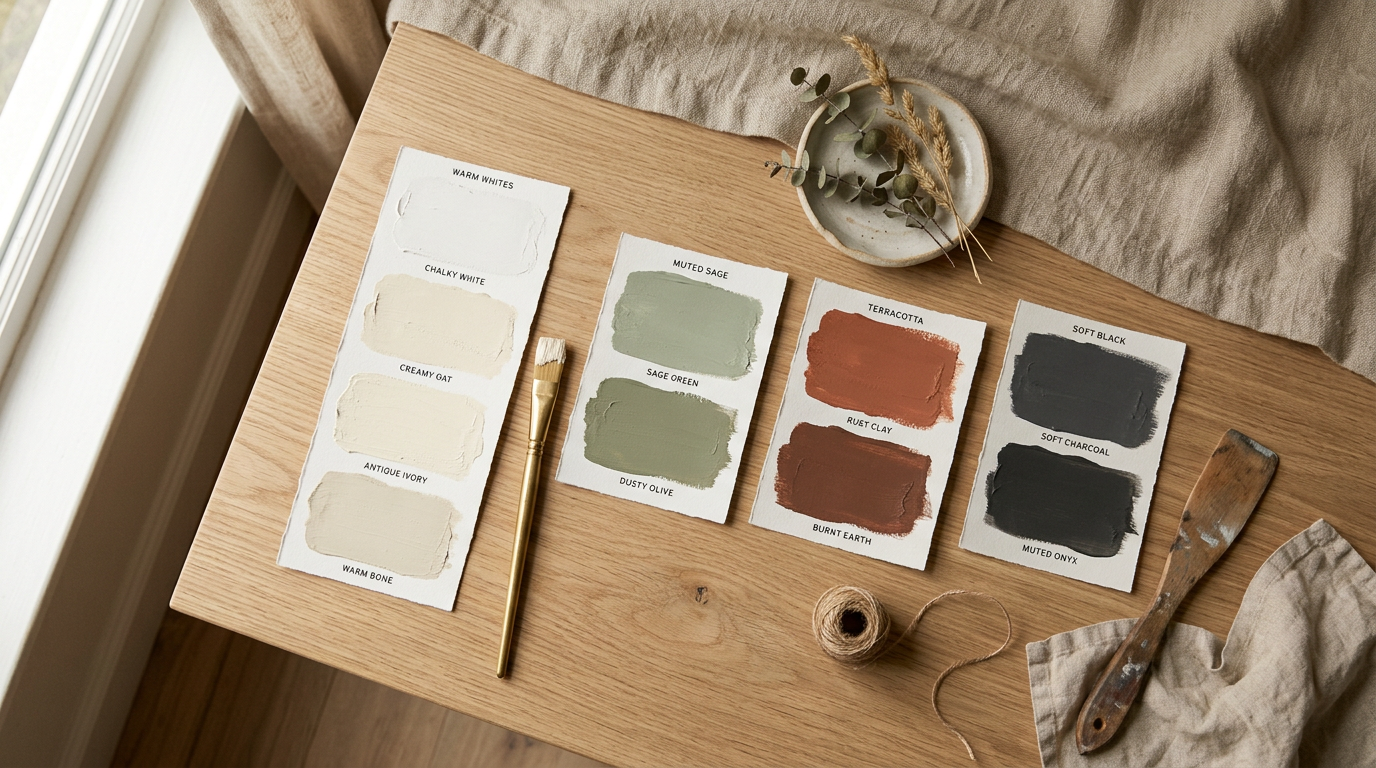
The era of sterile, clinical gray is officially behind us. Homeowners are trading cold, blue-undertoned grays for colors that offer a sense of sanctuary and warmth. The new neutral baseline relies heavily on warm whites, rich cream tones, and complex greiges that shift beautifully with the natural light of the day.
When we look at the warm whites dominating the market right now, two specific shades stand out for their versatility and soft undertones:
- Benjamin Moore White Dove (OC-17): A favorite among builders and designers, this shade has a tiny hint of gray and yellow, giving it a soft, creamy appearance without ever looking distinctly yellow. It is excellent for trim, ceilings, and walls alike.
- Sherwin-Williams Alabaster (SW 7008): This is a slightly warmer, cozier white. It provides enough contrast against bright white trim to feel intentional, yet remains bright enough to bounce natural light around a dark room.
Alongside these warm whites, we are seeing a rise in "greige"—the perfect middle ground between gray and beige. Unlike the cool grays of the last decade, modern greige contains yellow or brown undertones, making it pair beautifully with natural wood floors and warm leather furniture. This shift creates spaces that feel open and airy, but never cold.
Moody Kitchens: Deep Greens, Navies, and Warm Black
While living rooms are getting lighter and warmer, kitchens are embracing a touch of drama. The all-white kitchen is no longer the default choice. Instead, homeowners are opting for deeply saturated cabinetry that turns the kitchen into a focal point.
Three color families have emerged as frontrunners for high-end kitchen remodels:
- Deep Forest Greens and Olives: Rich greens bring a natural, earthy feel indoors. They pair exceptionally well with light oak flooring and stone countertops with heavy veining.
- Classic Navy: A timeless choice that bridges the gap between traditional and modern. Navy cabinets look incredibly grounding, especially when used on a large kitchen island.
- Warm Black and Charcoal: Instead of a stark, harsh black, look for charcoal tones with brown or green undertones. These shades feel velvety and soft rather than industrial.
To prevent these moody colors from feeling heavy, we pair them with metals that add warmth and reflection. Replacing cool chrome and polished nickel with unlacquered brass, brushed gold, or antique bronze hardware completely transforms the space. These warmer metals act like jewelry against dark paint, catching the light and creating a high-end, custom look.
The Two-Tone Kitchen Trend
If you love the look of dark, moody cabinets but worry about shrinking your space, the two-tone kitchen is the ideal compromise. This layout keeps the room feeling light and spacious at eye level while grounding the footprint with rich color.
| Cabinet Placement | Recommended Color Palette | Visual Effect |
|---|---|---|
| Uppers & Tall Pantries | Warm White, Soft Cream, or Light Oak | Keeps the ceiling feeling high; bounces natural light around the work surfaces. |
| Lowers & Island | Forest Green, Navy, Charcoal, or Rich Walnut | Grounds the room; hides everyday scuffs in high-traffic foot zones. |
Terracotta, Clay, and Earthy Accents
As we spend more time in our homes, there is a collective desire to feel more connected to nature. This has driven a massive surge in earth tones that go far beyond basic green. We are seeing a beautiful revival of terracotta, soft clay, warm ochre, and muted sage.
These colors are not the bright, saturated southwest shades of the 1990s. Today's earth tones are complex, dusty, and heavily muted with gray or brown undertones.
An earthy palette works beautifully in bathrooms and bedrooms, where relaxation is the primary goal. A powder bath painted in a dusty clay or a main bedroom with muted sage walls feels instantly serene. These tones are also highly compatible with natural materials like terracotta floor tiles, soapstone countertops, and white oak vanities.
Trending Palettes by Home Style
Choosing colors in isolation can be overwhelming. To help visualize how these colors, finishes, and woods work together, we have curated three highly successful palettes for the most popular architectural styles we work on today.
1. The Modern Farmhouse
The modern farmhouse style has matured. It is moving away from stark black-and-white contrasts and sliding barn doors, evolving into a softer, more historical look that feels authentic and comfortable.
- Main Walls: Sherwin-Williams Alabaster
- Trim & Millwork: Benjamin Moore Revere Pewter (a classic, warm greige)
- Kitchen Island or Accent: A soft, muted olive green
- Hardware & Dining Fixtures: Antique bronze or matte black
- Paring Materials: Reclaimed white oak beams, soapstone, and fireclay farm sinks
2. The Warm Minimalist
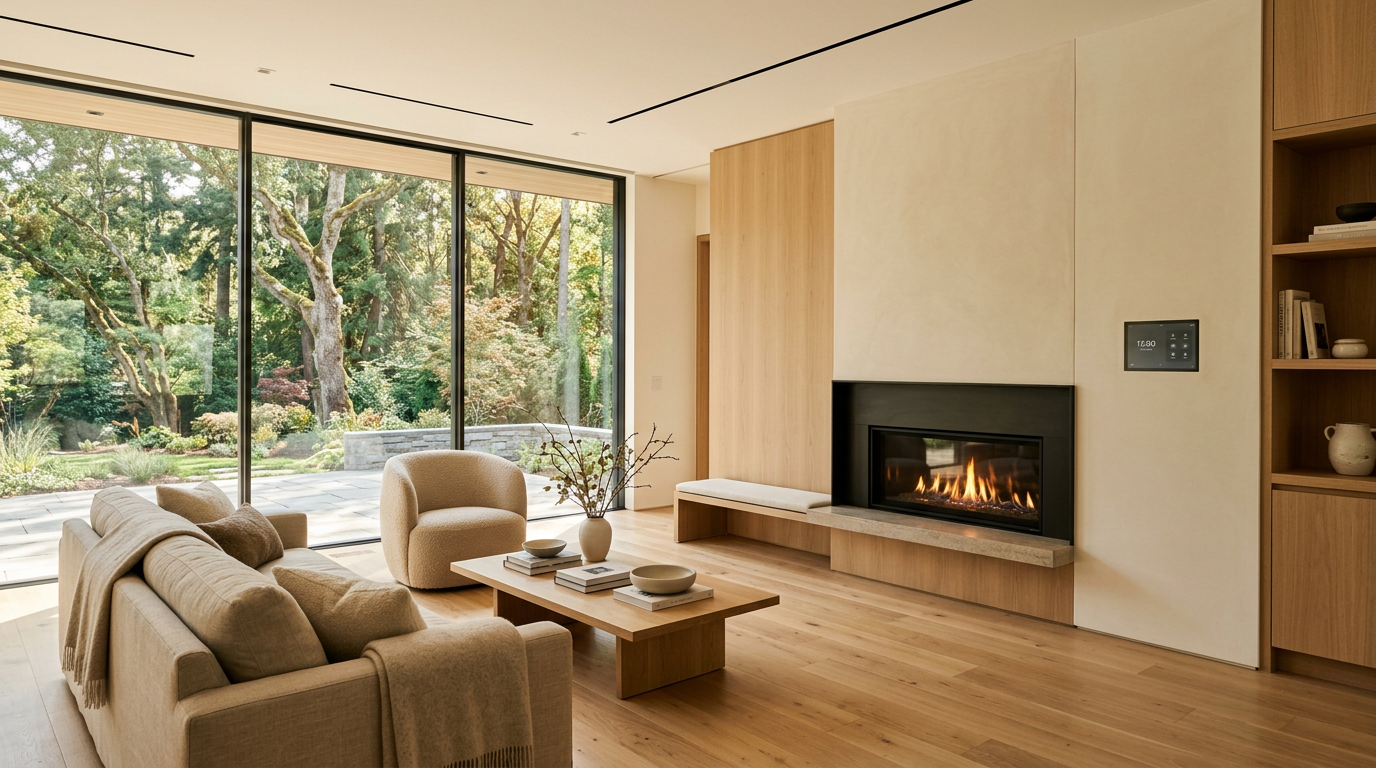
Minimalism no longer means living in a sterile concrete box. Warm minimalism focuses on texture, clean lines, and a very tight, warm color palette that relies on natural variations to create visual interest.
- Main Walls & Ceilings: Benjamin Moore Swiss Coffee (at 75% strength for a slightly cleaner look)
- Cabinetry & Built-ins: Flat-panel natural white oak with a clear, matte finish
- Accent Tones: Soft taupe, warm clay, and charcoal gray
- Hardware & Fixtures: Brushed brass or brushed stainless steel
- Pairing Materials: Travertine stone, boucle fabrics, and matte plaster wall finishes
3. The Transitional Home
For those who love classic architectural details but want a clean, updated feel, transitional design offers the best of both worlds. This palette balance traditional elegance with modern fresh tones.
- Main Walls: Sherwin-Williams Repose Gray (applied in spaces with plenty of natural light)
- Kitchen Cabinets: Rich navy blue lowers with warm white uppers
- Bathroom Vanity: Deep charcoal or a rich espresso stain on walnut
- Hardware & Fixtures: Polished nickel or unlacquered brass
- Pairing Materials: Carrara marble, classic subway tile with matching grout, and medium-brown oak floors
Bringing Wood Back into the Mix
You cannot discuss modern paint palettes without discussing wood finishes. For years, wood trim and cabinets were painted over without a second thought. Now, wood is being celebrated as a color in its own right.
Rather than the red-toned cherries and yellow-toned oaks of the past, the current focus is on white oak, walnut, and alder with matte, non-yellowing protective coats. When paired with warm whites or moody greens, the natural grain of dark walnut or light oak provides a textural element that paint simply cannot replicate. Using wood for a kitchen island, a bathroom vanity, or a fireplace mantel breaks up painted surfaces and adds a layer of organic sophistication to your home.
Selecting Paint with Confidence
The most important rule of picking a color palette is to never select a paint color based on a small paper swatch under showroom lights. Paint reacts dynamically to its environment. The direction your windows face, the maturity of the trees outside, the type of artificial lighting you use, and even the color of your flooring will completely alter how a paint color looks on your walls.
Before committing to a color, we always recommend applying large paint samples—or using roll-on peel-and-stick sample sheets—to multiple walls in the room. Observe how the color changes from the bright light of mid-morning to the warm shadows of late evening.
Nailing the perfect color palette is a mix of art and science, and it is one of our favorite parts of the design process. If you are preparing to remodel your kitchen, update a bathroom, or reimagine your entire main living area, our design team is here to help you select the finishes, woods, metals, and paint colors that will make your home feel cohesive and timeless. Reach out to Modern Builders today to schedule your free in-home estimate and let’s start planning your space together.